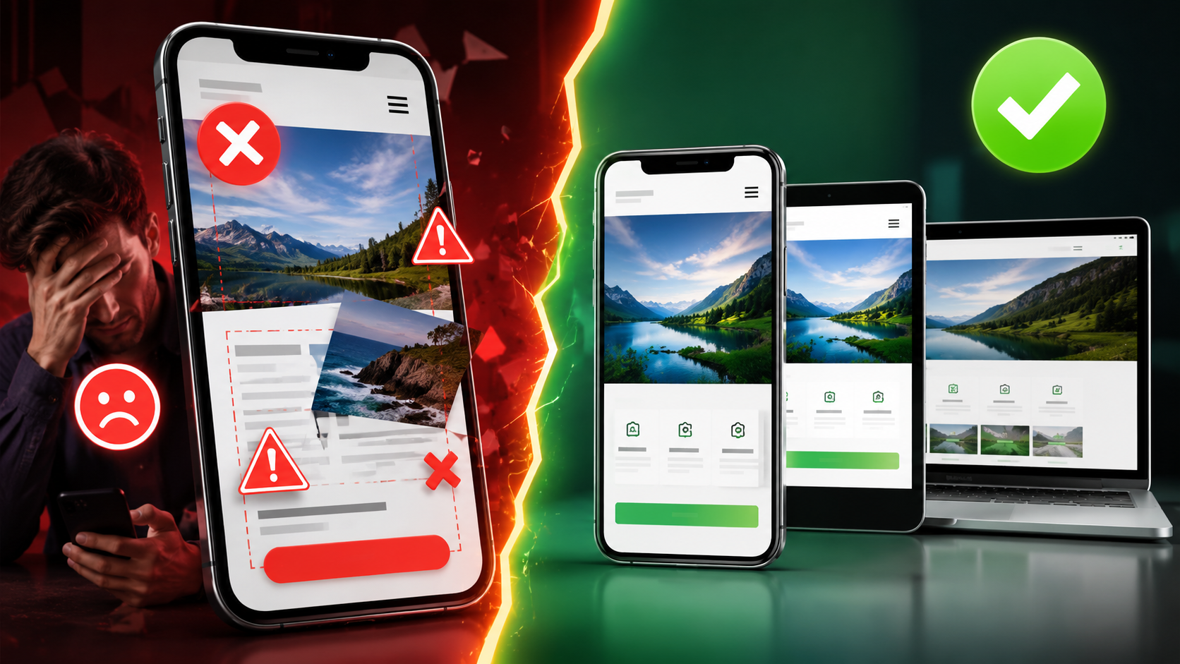
Why Your Website Not Working on Mobile Is a Serious Business Problem
More than 75% of internet users in India browse the web on a smartphone. If your website not working on mobile is turning away even half of those visitors, you are losing real customers every single day. This is not a minor technical glitch — it is a direct hit to your revenue and your reputation.
Mobile website problems are more common than most business owners realize, especially for websites built 3–5 years ago or on outdated platforms. The good news? Every single cause has a fix. Let us walk through the 7 most proven reasons your website breaks on mobile — and what you should do about each one.
Why Does My Website Break on Mobile Phones?
The short answer: your website was either never built for mobile screens, or it was built with outdated code that does not adapt to modern smartphones. A website that looks perfect on a desktop computer can look completely shattered on a 5-inch Android screen if the developer did not follow mobile first design principles.
There is no single culprit. Usually, it is a combination of missing technical elements — a forgotten viewport meta tag, absent CSS media queries, unoptimised images, or a theme that simply was not designed for today's devices. Let us break each one down.
Reason 1: Missing or Incorrect Viewport Meta Tag
The viewport meta tag is a single line of code that tells a browser how to scale your website on a mobile screen. Without it, your browser has no idea how wide the screen is — so it renders the full desktop version and shrinks it down, making text tiny and buttons impossible to tap.
This is one of the most common mobile website errors we see, especially on older websites. The fix is simple: add the correct viewport meta tag to your HTML head section. If you are not sure whether your site has it, run a quick Google Mobile Friendly Test — it will flag this immediately.
Reason 2: No CSS Media Queries in the Code
A website that looks great on a 1920px desktop monitor needs completely different layout rules for a 375px mobile screen. CSS media queries are the instructions that tell your website to rearrange columns, resize fonts, and stack elements vertically when the screen gets smaller.
If your developer skipped media queries — or used a rigid fixed-width layout — your website layout broken on android phone problem will persist no matter what else you try. This is a foundational issue that requires proper responsive web design from the ground up.
Reason 3: Images Are Too Large or Not Optimised
A high-resolution banner image that looks stunning on a desktop can take 8–10 seconds to load on a mobile data connection. In India, where many users are still on 4G networks with variable speeds, page speed mobile is absolutely critical. Studies show that 53% of mobile users abandon a site that takes more than 3 seconds to load.
Unoptimized images also cause website display issues on mobile — images overflow their containers, break the layout, or simply do not load at all. Every image on your website should be compressed, correctly sized, and ideally served in modern formats like WebP.
What Causes a Website to Look Different on Mobile and Desktop?
This is one of the most frequently asked questions we receive from small business owners across India. The core reason is simple: desktop and mobile screens are fundamentally different environments. A desktop has a wide screen, a mouse pointer, hover effects, and fast internet. A mobile has a narrow screen, touch-based navigation, and often slower connectivity.
A non responsive website treats both environments the same way — and that is exactly why it fails on mobile. Proper mobile usability requires designing for both environments separately, or using a fluid responsive framework that adapts automatically. If your website was built without this consideration, you will always see a difference between desktop and mobile views.
Reason 4: Buttons and Links Are Too Small to Tap
On a desktop, you click with a precise mouse cursor. On a mobile, you tap with your finger — which covers a much larger area. If your buttons, menu items, or call-to-action links are too small or placed too close together, users will either tap the wrong thing or give up entirely.
This is a classic mobile website problem that directly damages conversions. Google's guidelines recommend a minimum tap target size of 48x48 pixels. If your small business website not working on smartphone is causing frustration, oversized or poorly spaced touch elements are often a major contributing factor. Good touch screen navigation design is non-negotiable in 2024.
Reason 5: Flash, Pop-ups, or Unsupported Elements
Flash is completely dead on mobile — Apple never supported it, and Android dropped it years ago. Yet some older websites still use Flash for animations, sliders, or even entire sections. If your site uses Flash, those sections simply will not appear on any smartphone.
Aggressive pop-ups are another culprit. Large interstitial pop-ups that cover the entire screen on mobile are not only frustrating for users — Google actively penalises them in mobile search rankings. If you are wondering why my website is not mobile friendly in India, check whether your site uses any of these outdated or intrusive elements.
Reason 6: The Website Was Built on a Non-Responsive Theme or Template
Many businesses in India got their first website built on a cheap WordPress theme or a basic HTML template 4–5 years ago. At that time, mobile optimisation was not a priority for budget developers. The result? A website that was never truly designed for mobile screens.
This is especially common with website not displaying correctly on mobile phone India complaints we receive. The theme itself is the problem — and no amount of tweaking will fully fix a fundamentally non-responsive foundation. In these cases, a rebuild using modern responsive web design principles is the only lasting solution.
Reason 7: JavaScript Errors Breaking the Mobile Layout
JavaScript powers interactive elements — sliders, dropdown menus, forms, and animations. But JavaScript that works perfectly on a desktop browser can behave completely differently on a mobile browser, especially on older Android devices. A single JavaScript error can cause your entire navigation menu to disappear or your contact form to stop working.
These mobile website errors are often invisible to the business owner because they only appear on specific devices or browsers. Regular testing on actual Android and iOS devices — not just desktop browser simulators — is the only reliable way to catch these issues before your customers do. This is also why our SEO services include technical testing across real devices, because broken scripts hurt both usability and search rankings.
Does a Broken Mobile Website Affect Google Ranking?
Absolutely — and significantly. Since 2019, Google has used mobile first indexing for all websites. This means Google primarily uses the mobile version of your website to determine your search ranking. If your mobile version is broken, slow, or incomplete, your Google ranking suffers — even if your desktop version is perfect.
A website not mobile friendly will also have higher bounce rates (people leaving immediately), lower time-on-site, and fewer conversions — all signals that tell Google your website is not providing a good user experience. The result is lower rankings, less organic traffic, and fewer enquiries for your products and services. Fixing your non responsive website problems is not just a design decision — it is an SEO decision.
How to Fix Website Mobile Display Problems
Here is a practical checklist to address how to fix website mobile display problems step by step:
- Run the Google Mobile Friendly Test — free tool at search.google.com/test/mobile-friendly. It shows exactly what is broken.
- Check your viewport meta tag — make sure it is present and correctly configured in your HTML.
- Audit your images — compress all images, use correct dimensions, and avoid images wider than the screen.
- Test on real devices — use an actual Android phone and iPhone, not just a browser simulator.
- Review your CSS — ensure media queries are in place for common breakpoints (320px, 480px, 768px, 1024px).
- Check touch targets — all buttons and links should be easy to tap with a finger.
- Remove Flash and intrusive pop-ups — replace with modern HTML5 alternatives.
If the issues run deep — like a non-responsive theme or missing media queries throughout the codebase — a professional rebuild is the most cost-effective long-term solution.
How Much Does It Cost to Fix a Mobile Responsive Website in India?
The cost depends entirely on the severity of the problem. Here is a realistic breakdown for Indian businesses:
- Minor fixes (viewport tag, image compression, button sizing): ₹2,000 – ₹5,000
- Theme/template replacement on an existing WordPress site: ₹7,500 – ₹10,000
- Full responsive rebuild — basic business website: starting from ₹12,000 (includes domain, hosting, SSL, and Full Admin CRM)
- Custom PHP responsive website — more powerful, scalable, and future-proof: ₹12,000 onwards
At Infinite Option, we build 90% of our websites in Custom PHP — which means your website is built from scratch for your exact needs, with proper CSS media queries, optimised images, and full mobile first design baked in from day one. Our web development services give you a solid foundation you can build on for years — unlike WordPress themes that break when plugins update, a custom-built website is a foundation that lasts.
Every project of ₹12,000 and above includes a .com domain, 1 year hosting, SSL certificate, and Full Admin CRM — so you can manage your own content without needing a developer every time.
How Do I Make My Website Mobile Friendly in India?
The most reliable way is to work with a development team that prioritises mobile usability from the very beginning — not as an afterthought. Here is what a proper mobile-friendly build looks like:
- Mobile first design approach — design for the smallest screen first, then scale up
- Correct viewport meta tag and fluid grid layout
- CSS media queries for all major screen sizes
- Compressed, correctly sized images with lazy loading
- Touch-friendly navigation with adequate tap target sizes
- Fast page load speed — under 3 seconds on mobile data
- Regular testing on real Android and iOS devices
If your current website fails on any of these points, it is time for a conversation with a professional team.
Stop Losing Customers to a Broken Mobile Website
Every day your website not working on mobile stays broken is another day potential customers are bouncing to your competitor. In a mobile-first country like India, this is not a problem you can afford to ignore.
Infinite Option has delivered 70+ websites for businesses across India and internationally — all built with proper responsive web design, mobile usability, and full admin control. Whether you need a quick fix or a complete rebuild, our team in Howrah, West Bengal is ready to help.
📞 Call or WhatsApp us at 090629 83118 (Mon–Sat, 11 AM – 7 PM) or visit our office at G2/A, 94, Shibpur Rd, Howrah. Let us audit your website for free and tell you exactly what needs to be fixed — no jargon, no hidden charges, just honest advice.